
Autoria
André Marafona
Ano
2019-2020
Curso
Licenciatura em Design
Resumo
PT
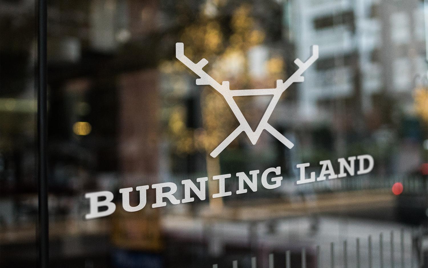
Burning Land surge como resposta ao briefing proposto para a unidade curricular de Projecto Final e Exposição. Uma marca de cosméticos masculinos. Uma ideia sarcástica ao ato de destruição, desflorestação e, ao mesmo tempo, como ato de revolta. Uma marca limpa mas com um peso enorme na mensagem e objetivo que pretende transmitir. O veado como mascote da Burning Land deve-se à grande ligação com a Natureza e à sua forma. Formas triangulares associam-se ao homem, a deuses e à Natureza. Na mitologia, acredita-se que este é um ser dotado de poder e sensibilidade, com forte ligação à fertilidade, é conhecido por ser um ser altruísta. Para os celtas, simboliza a força da Natureza. No budismo, a harmonia, a longevidade e é considerado um bom ouvinte, aquele que transmite paz. Foram escolhidas duas fontes de suporte à marca. Courier Prime como fonte principal que acompanha o ícone da marca e Roboto Mono como fonte auxiliar. Para o package, escolhemos materiais que possam ser reutilizados e recicláveis. Os diferentes padrões presentes ao longo da gama de produtos, foram inspirados na cultura do Norte Europeu como Celtas e Vikings.
EN
Burning Land appears as a response to the briefing proposed for the curricular unit of Final Project and Exhibition. A brand of men’s cosmetics. A sarcastic idea of the act of destruction, deforestation and, at the same time, as an act of revolt. A clean brand but with a huge weight in the message and objective that the brand wants to show. The deer as a mascot of Burning Land is due to the great connection with Nature and its shape. Triangular shapes are associated with man, gods and nature. In mythology, it is believed that this being a being endowed with power and sensitivity, with a strong connection to fertility, is known to be an altruistic being. For the Celts, it symbolizes the strength of Nature. In Buddhism, harmony, longevity and is considered a good listener, one who conveys peace. Two sources of support for the brand were chosen. Courier Prime as the main font that accompanies the brand icon and Roboto Mono as an auxiliary font. For the package, we chose materials that can be reused and recyclable. The different patterns present throughout the product range were inspired by the culture of Northern Europe such as Celts and Vikings.


