

Autoria
Ana Dias
Ano
2019-2020
Curso
Licenciatura em Design
Resumo
PT
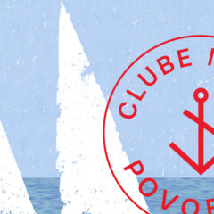
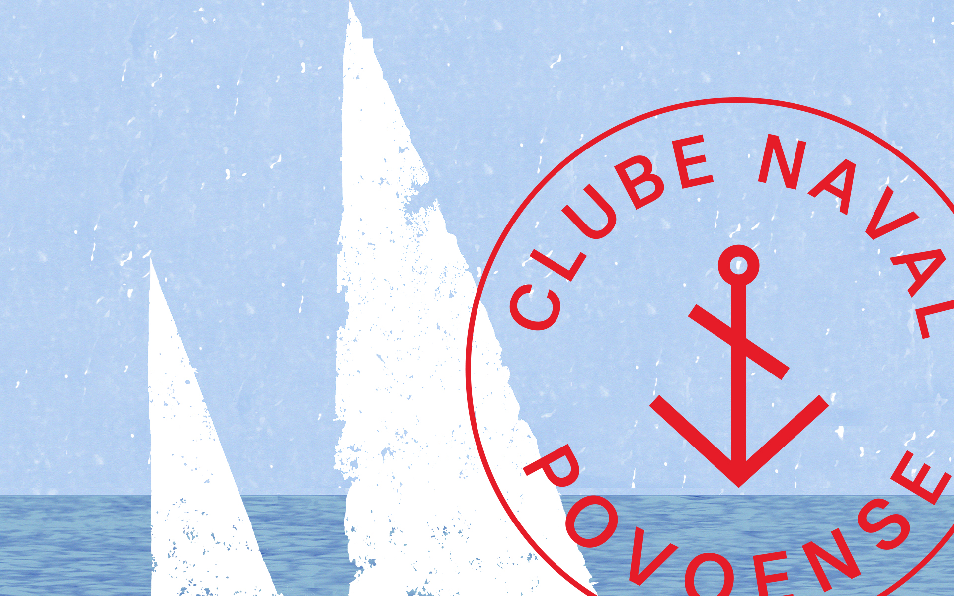
A identidade desenvolvida para projeto final foi para o Museu Etnográfico da Póvoa de Varzim. Por esta ser uma cidade cheia de tradições e costumes, foi elaborada uma pesquisa sobre a mesma e sobre os itens que o museu possui, tendo sempre em consideração a vida poveira, a religião, o mar e todos as suas tradições. O logotipo desenvolvido pretende relembrar a camisola poveira, esta sendo uma tradição muito importante e relevante para a cidade, pretendi inspirar-me na mesma. A ideia da cruz, do preto e vermelho estiveram sempre presentes na criação do logotipo e de toda a identidade. Com uma cruz irregular, com uma terminal maior que a outra, pretende relembrar a cruz da camisola, e vista como uma única peça pretende relembrar um peixe com todo o seu corpo e a sua cabeça. Com o formato circular relembramos o infinito pois o museu pretende ser algo que não tenha um único tempo mas sim uma continuidade. Ao redor do trabalho foi desenvolvida uma linguagem gráfica à volta da camisola poveira, sendo esta simples mas minimalista. Foram desenvolvidas ilustrações conforme as áreas demonstradas no museu para identificar cada uma delas.
EN
In the final project, an identity was developed for the Ethnographic Museum of Póvoa de Varzim. Because this is a city full of traditions, research was made about the same city and the items possessed by the museum, always considering the lifestyle in the region, its religion, the sea and all of its traditions. The developed logotype aims to remember the traditional shirts in the region as it is a very important and relevant tradition for the city, so I tried to inspire myself in it. The idea of the cross, red and black were always present in the creation of the logotype and the remaining identity. With an irregular cross, with a terminal bigger than the other, we try to remember the cross in the shirt, and seen as a single piece it tries to remember a fish with all of its body and head. With the circular shape, we remember the infinity as the museum is something that doesn’t belong to a single time period, but to a continuous. Throughout the project, a graphical language was developed around the traditional shirt, this language being simple but minimalist. Illustrations were also developed according to the demonstrated areas of the museum to identify each one of them.


