

Autoria
Cláudia Moreira
Ano
2018-2019
Curso
Licenciatura em Design – Design Gráfico e Publicidade
Resumo
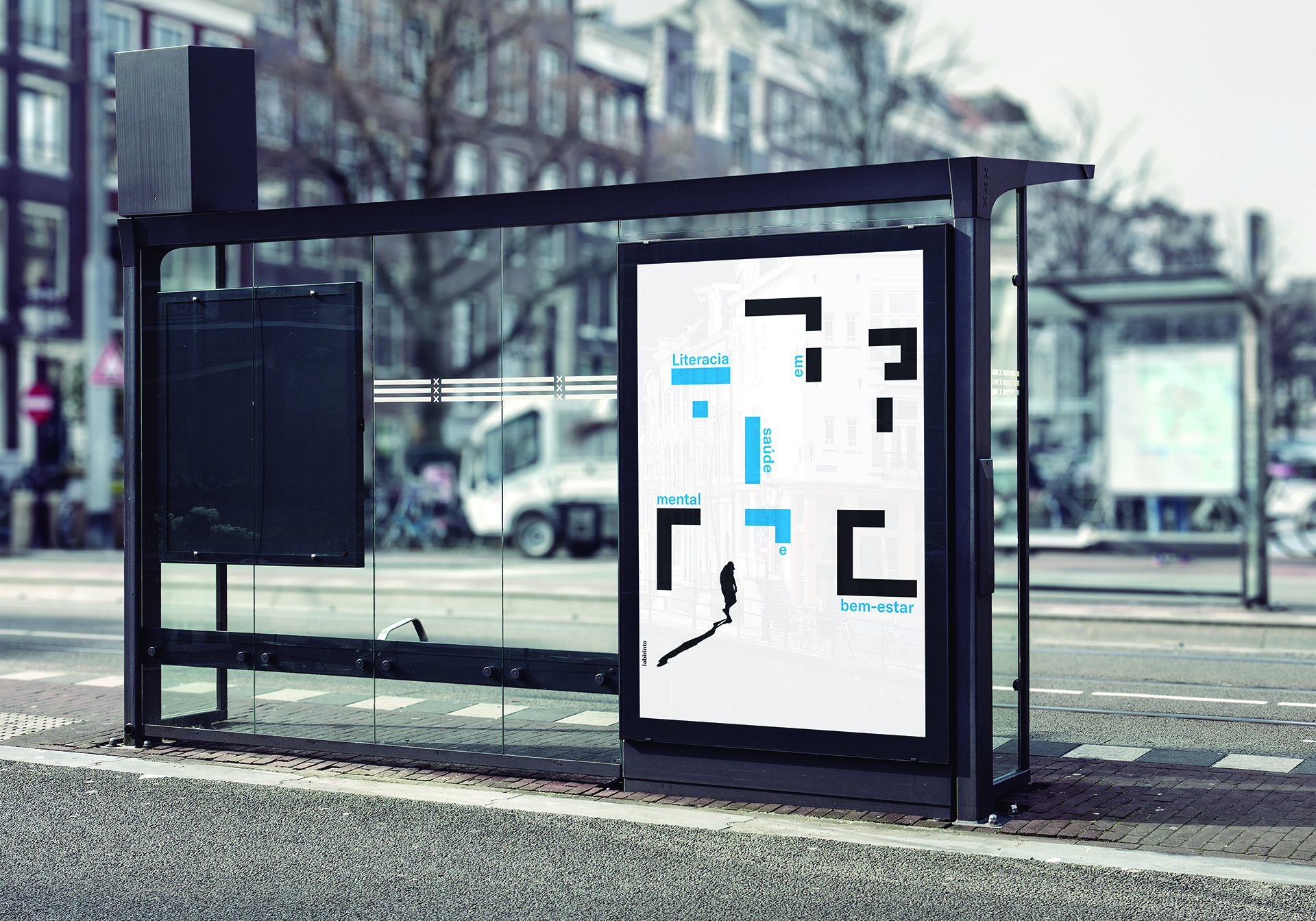
PT
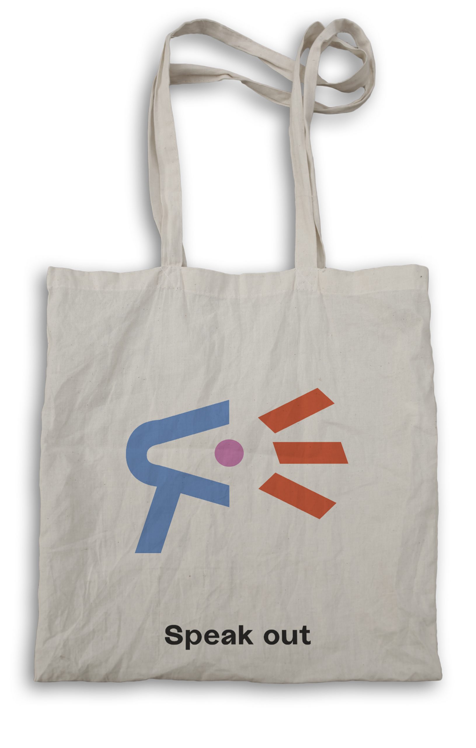
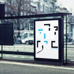
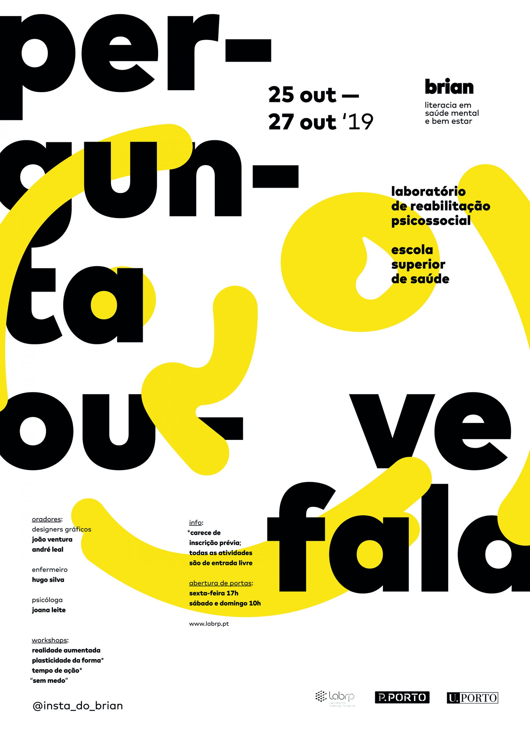
SEITIES, nome escolhido para a ação de literacia em saúde mental e bem estar impulsionada pelo Laboratório de Reabilitação Psicossocial, surge de uma necessidade em trazer para discussão, primeiramente na área metropolitana do Porto e posteriormente num contexto mais extenso, todas as questões associadas à saúde mental. Partindo de uma intenção em transparecer equilíbrio e segurança, a escolha desta palavra segue desde logo essa abordagem na forma como é morfologicamente composta (palíndromo). Para além disto, a sua sonoridade, “say-it-is”, permite uma dualidade que acaba por transmitir um sentimento de incentivo no que toca ao assumir destes problemas. A caraterização deste projeto visa uma atitude positiva, afirmativa e muito direta na forma como todos os temas são trabalhados e, como consequência, tudo isto acaba por se revelar na forma como o logótipo aparece representado. Resumidamente, as duas letras I presentes na palavra aparecem substituídas por um ponto e vírgula e um ponto de exclamação que procuram representar a informação disponível e o caráter alerta do departamento ao ajudar todos os que o procuram, respetivamente.
EN
SEITIES, the chosen name for the initiative of literacy in mental health and well being driven by the Laboratório de Reabilitação Psicossocial, arises from a need to bring to the table, first in the metropolitan area of Porto and later in a more extensive context, all issues associated with mental health. Starting off with the intention to show balance and safety, the choice of this word specifically, immediately follows this approach in the way it is morphologically composed (palindrome). In addition, the way that it sounds when pronounced out loud, “say-it-is”, allows a duality that ends up conveying a feeling of encouragement when it comes to assuming these problems. The characterization of this project aims at a positive, affirmative and very direct attitude in the way in which all the subjects are translated and, as a consequence, all this reveals itself in the way the logo appears represented. Briefly, the two letters I present in the word appear replaced by a semicolon and an exclamation point, respectively, that seek to represent
the amount of available information and the awareness of the department while helping those who reach out for it.


