
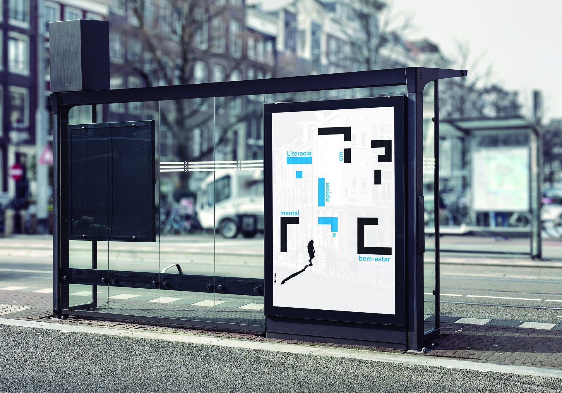
Autoria
Marlene Gomes
Ano
2019-2020
Curso
Licenciatura em Design
Resumo
PT
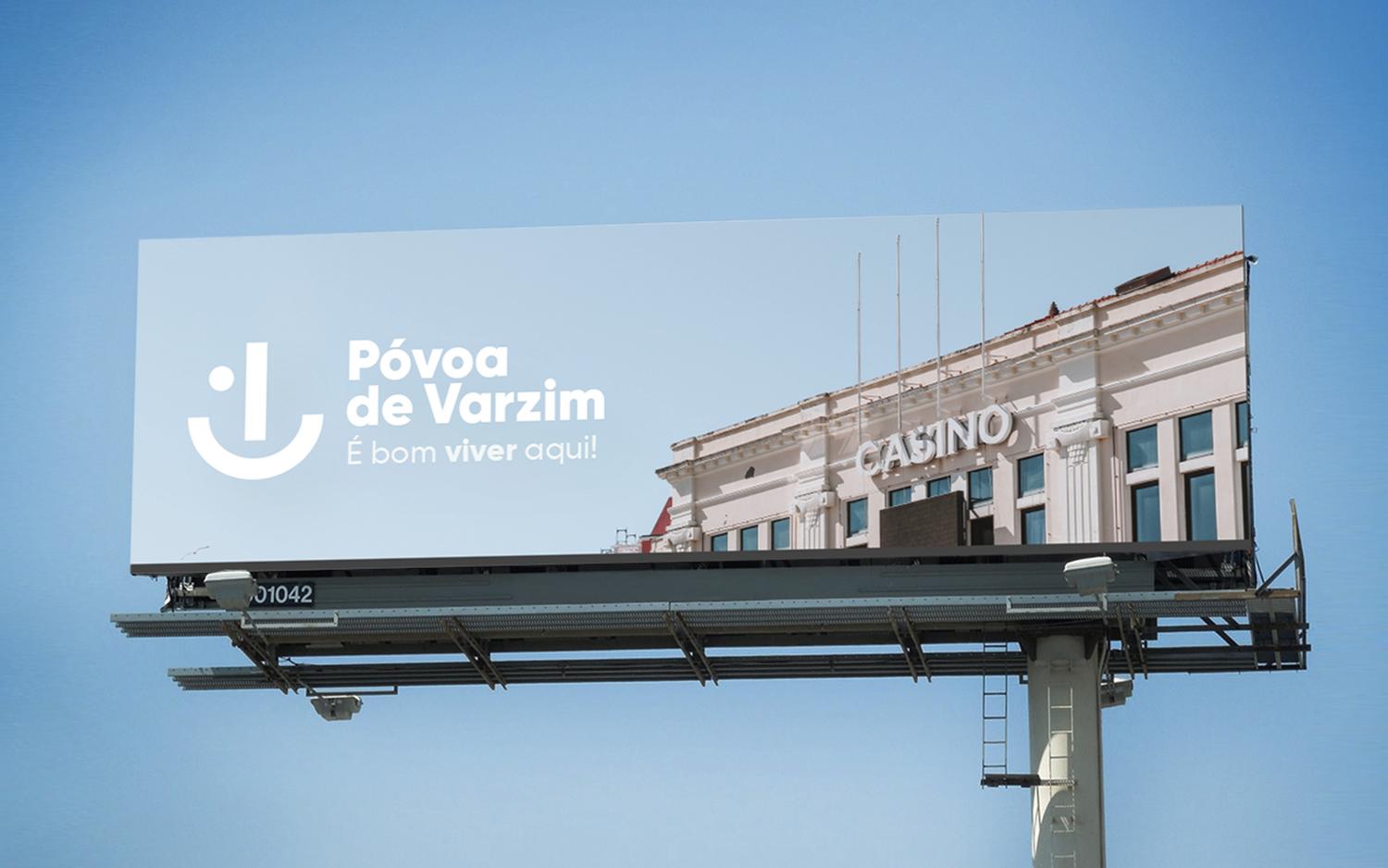
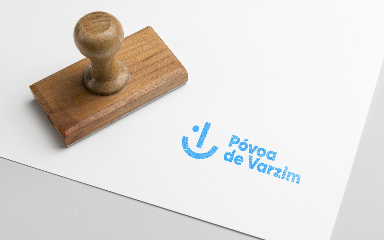
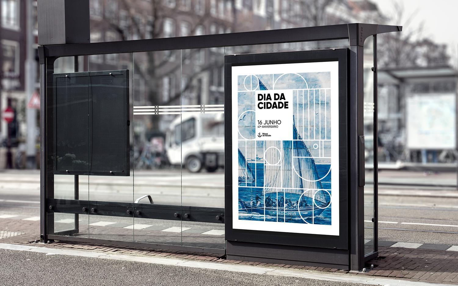
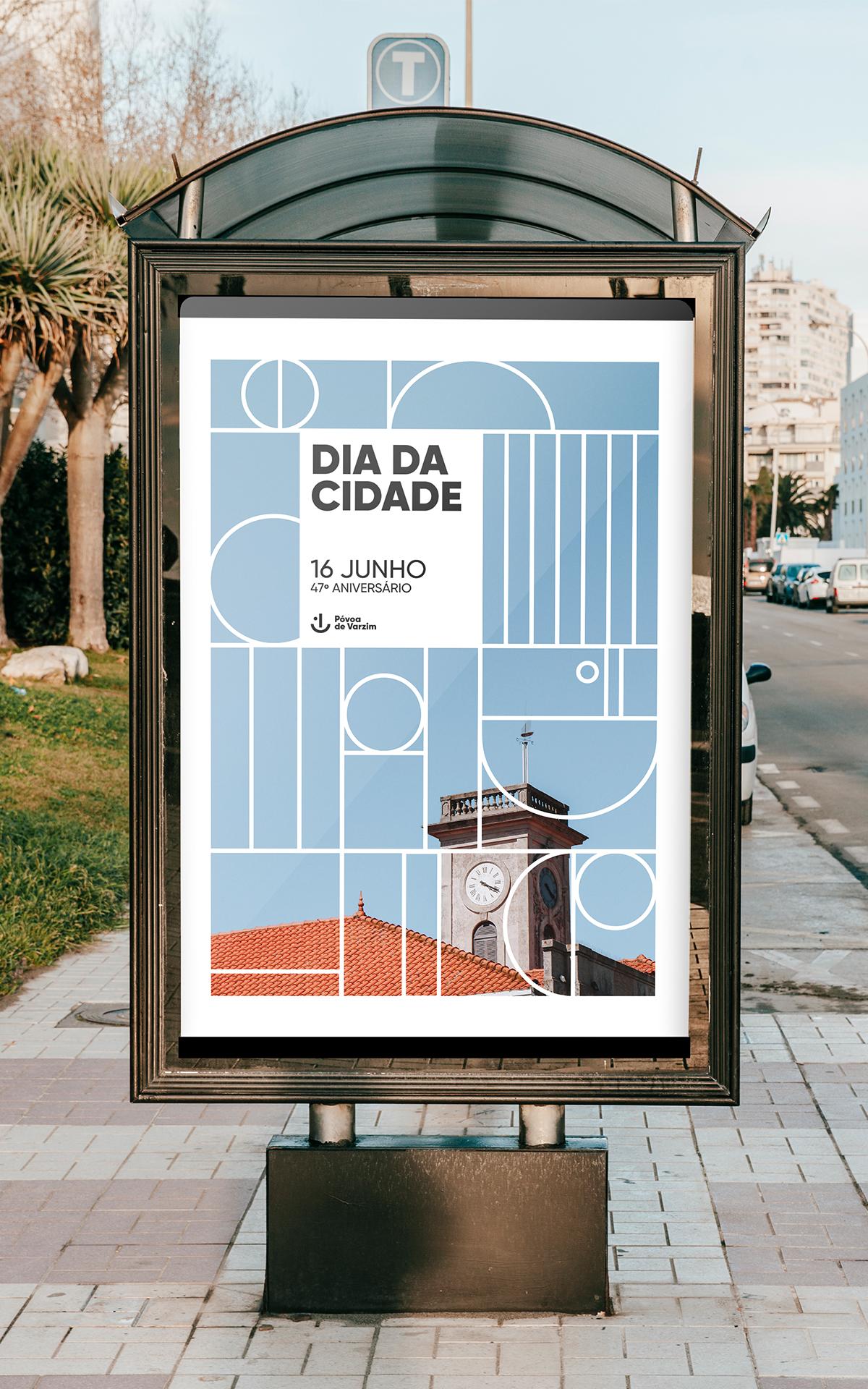
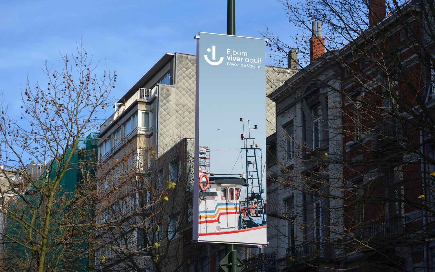
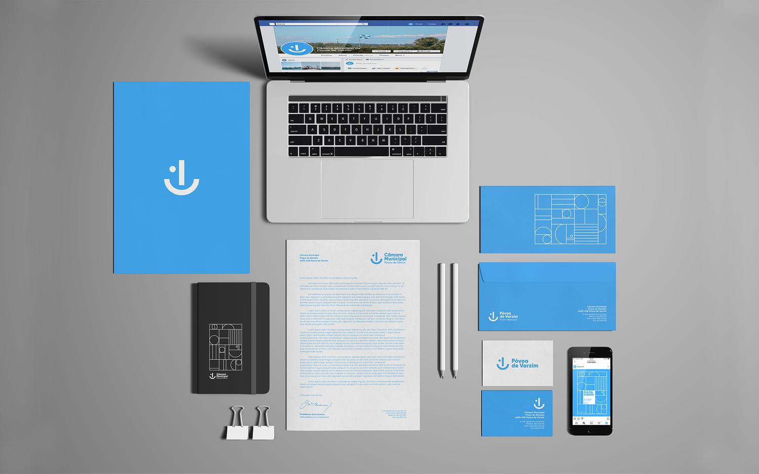
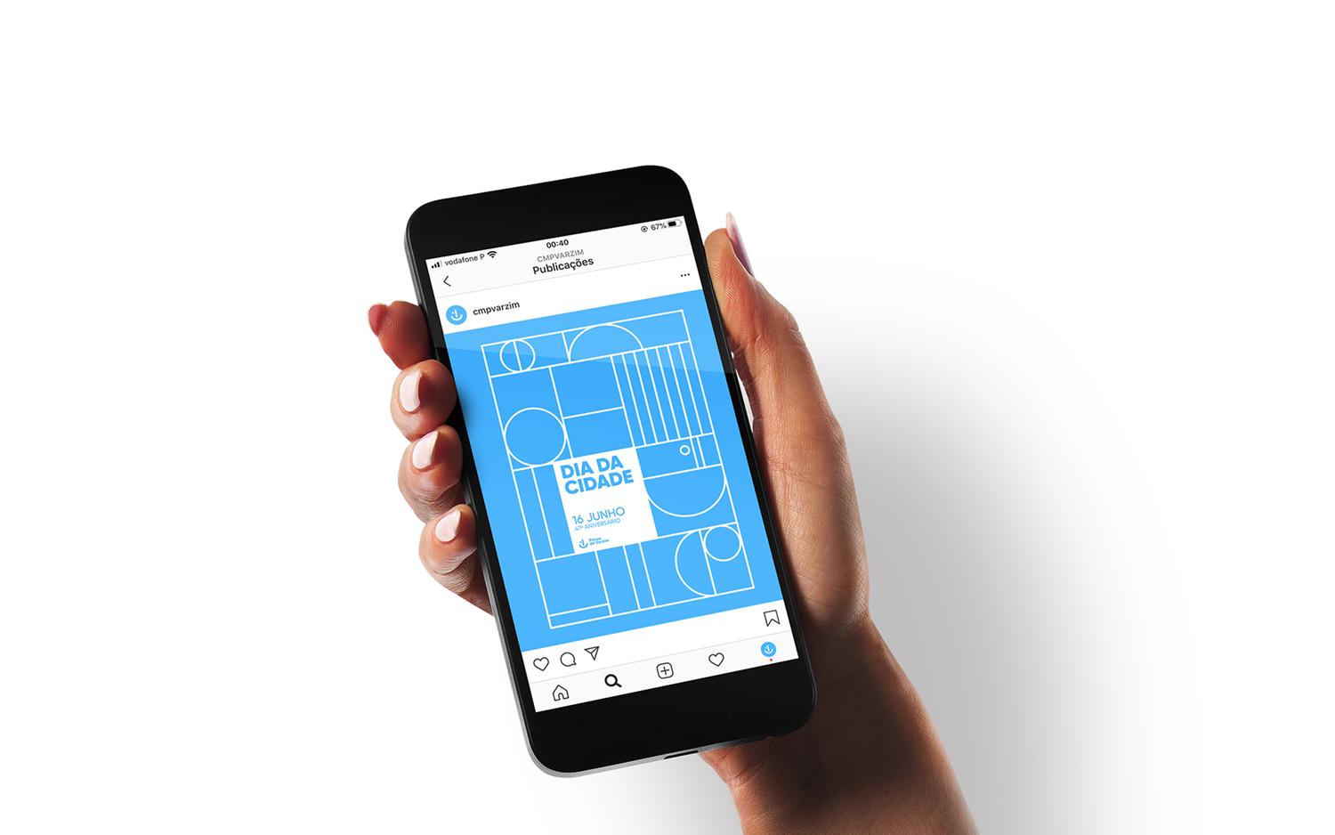
A Póvoa de Varzim é uma cidade para encher os pulmões de ar puro. É uma cidade rústica, marítima, piscatória, campestre, antiga e moderna. As suas praias são um autêntico cartaz de turismo, onde banhistas de todas os lugares e classes se juntam. Foi a história da Póvoa e o ambiente que nela se vive, que me inspirou para o novo conceito da identidade para a cidade. Para a definição do logótipo, aliei um conjunto de ideias, que vieram a resultar numa só imagem. O logótipo tornou-se de tal modo versátil, que dependendo de como o nosso imaginário o interpreta, conseguimos perceber as quatro ideias que nele estão presentes: o barco poveiro; o sol e a linha do mar (já patentes no logótipo atual da cidade); a âncora e o sol (resultante da simplificação do brasão da cidade) e, por se tratar de uma cidade carregada de energia, força, movimento e alegria, tal também precisava de estar refletido no logótipo. Criei ainda um padrão dinâmico inspirado nas formas do logótipo e na história da cidade, onde estão presentes todas as ideias referidas anteriormente, mas também remetendo aos aquedutos, que resultou num sistema que é facilmente configurável, permitindo infinitos resultados finais.
EN
Póvoa de Varzim is a city to fill your lungs with fresh air. It is a rustic, maritime, fishing, rural, ancient and modern city. Its beaches are an authentic tourism poster, where bathers from all places and classes come together. It was the history of Póvoa and the environment in the city, that inspired my new identity concept for the city. For the definition of the logo, I combined a set of ideas, which resulted in a single image. The logo has become so versatile that, depending on how our imagination interprets it, we can understand the four ideas that are present in it: the poveiro boat; the sun and the sea line (already shown in the current city logo); the anchor and the sun (resulting from the simplification of the city’s coat of arms) and, because it is a city charged with energy, strength, movement and joy, this also needed to be reflected in the logo. I also created a dynamic pattern inspired by the shapes of the logo and the history of the city, where all the ideas mentioned above are present, but also referring to the aqueducts, which resulted in a system that is easily configurable, allowing infinite final results.

