

Autoria
Inês Magalhães
Curso
Licenciatura em Design Gráfico
Resumo
PT
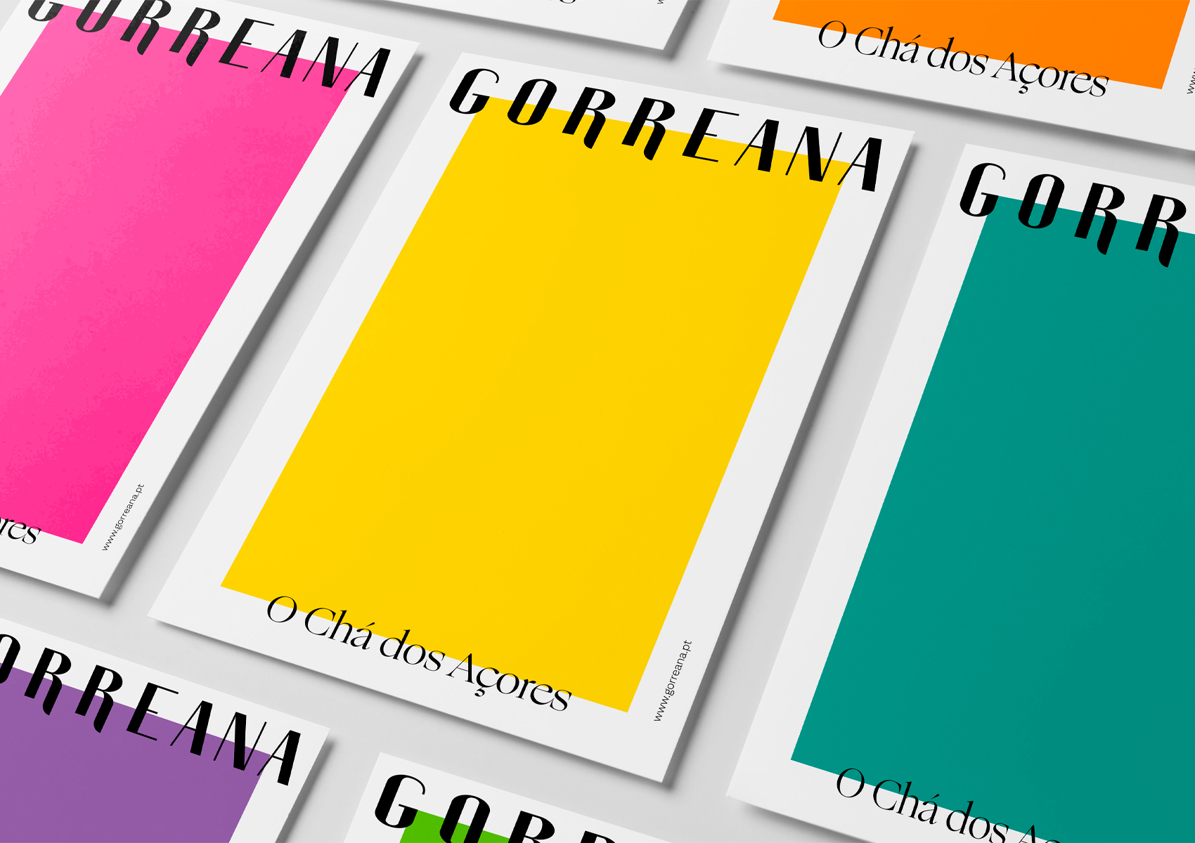
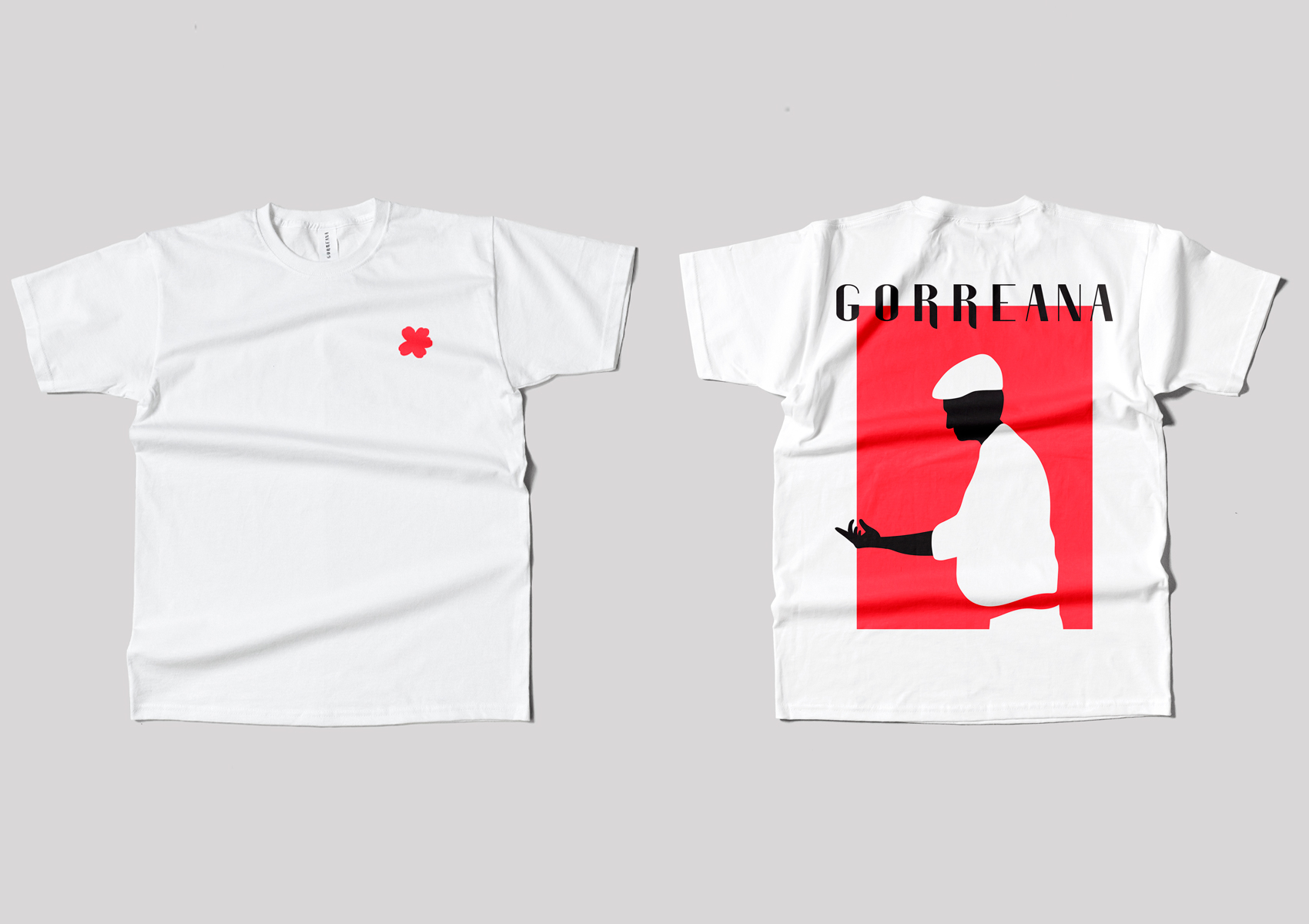
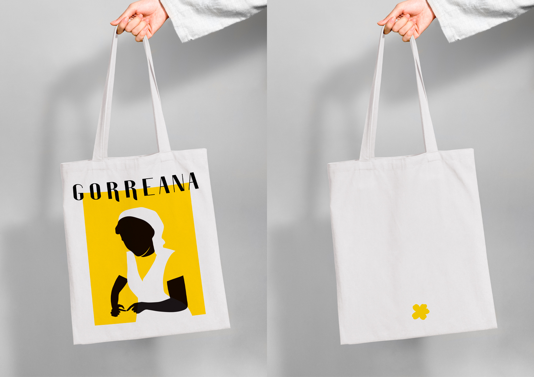
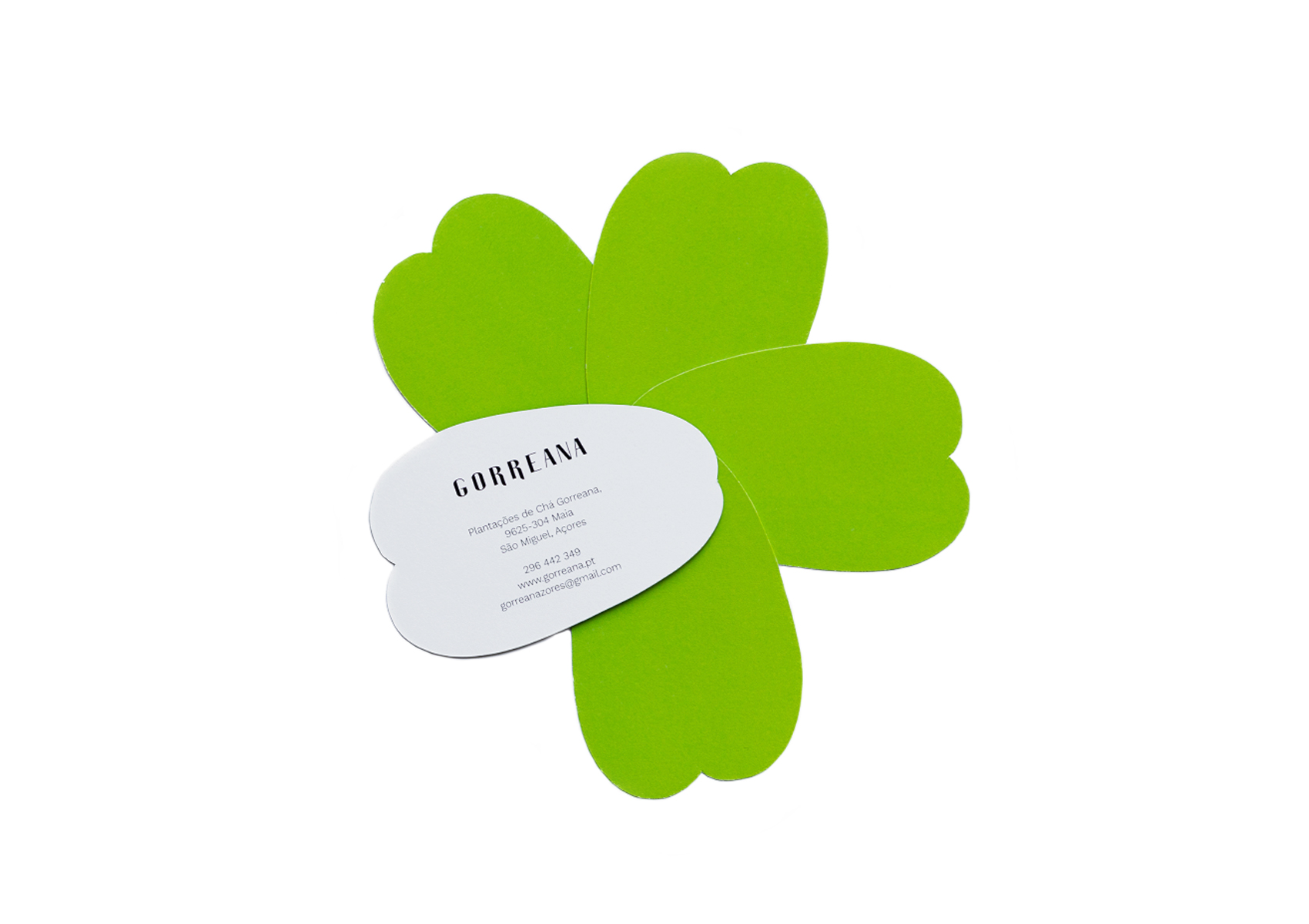
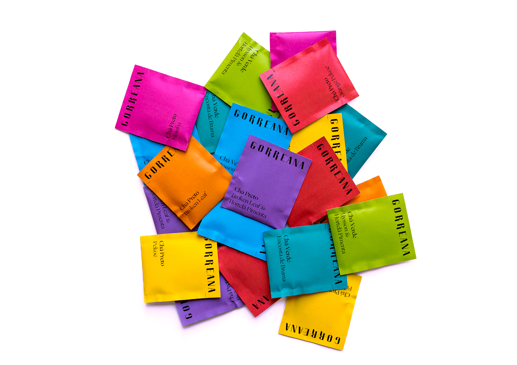
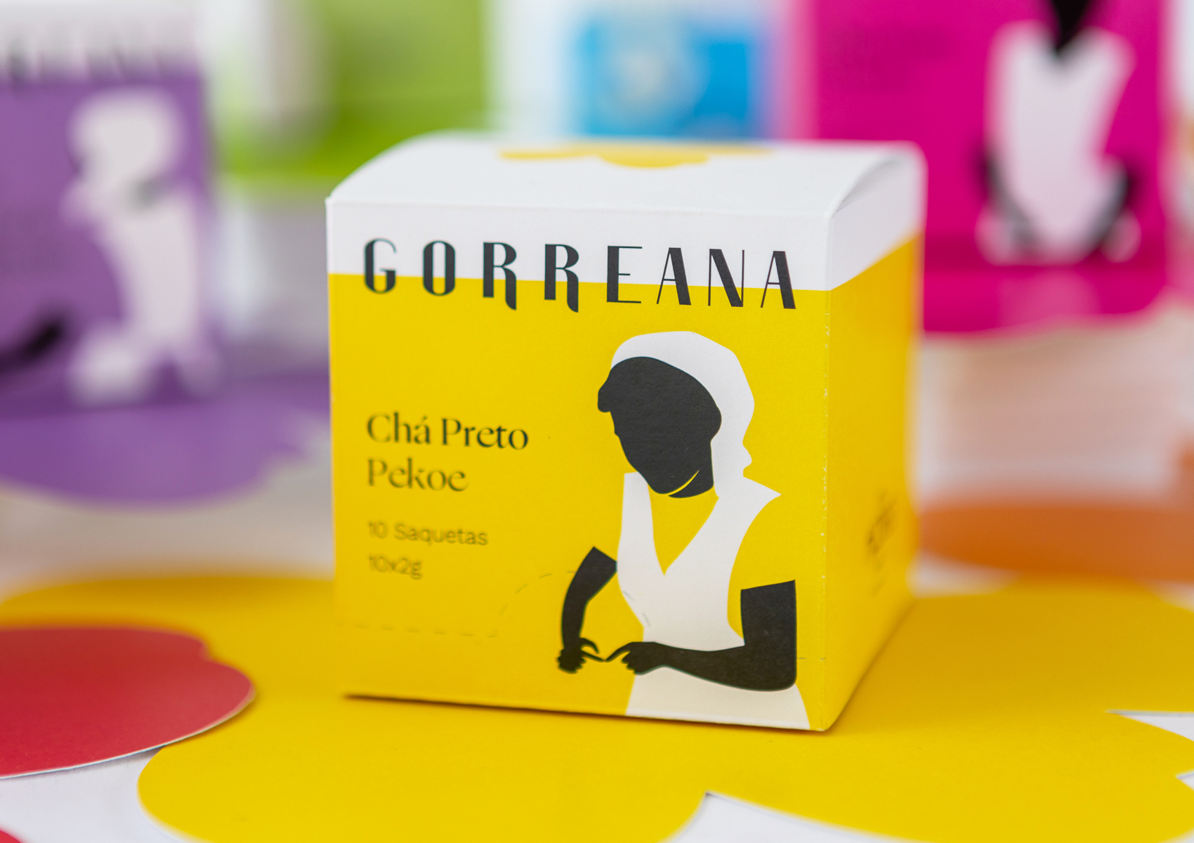
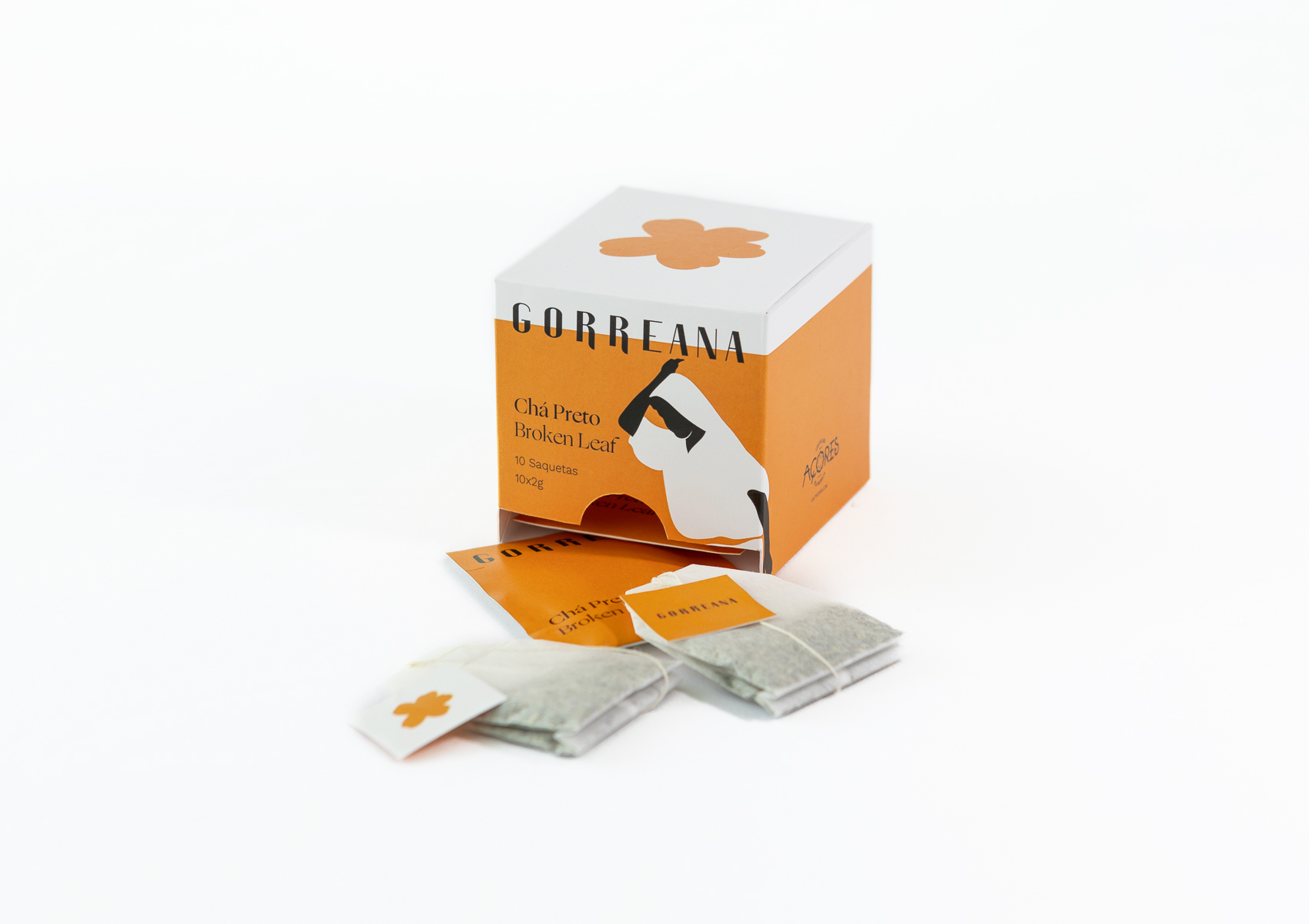
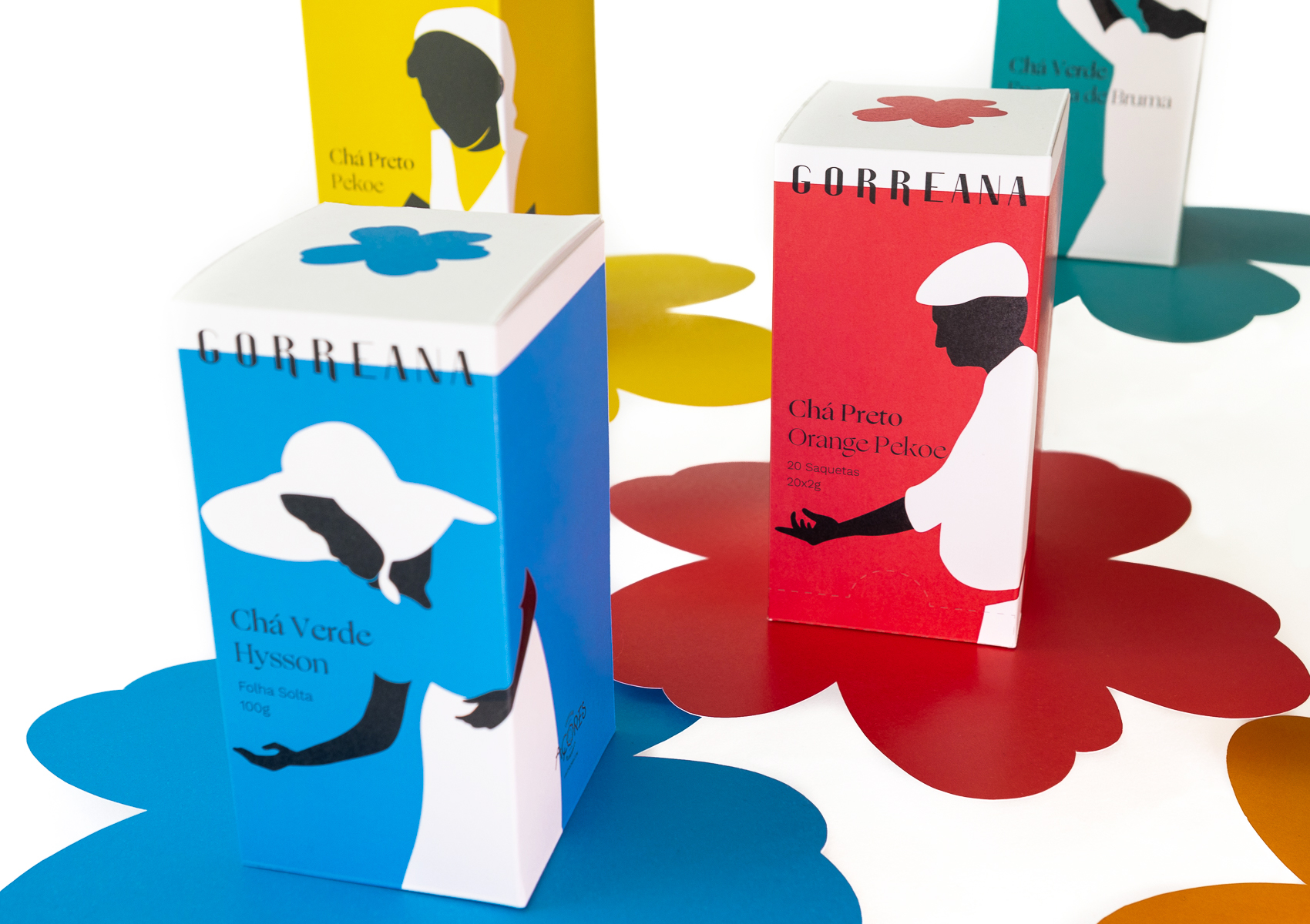
Este projeto consiste na melhoria da identidade visual da marca Gorreana e no desenvolvimento de um novo conceito de identificação dos seus produtos e das suas respetivas embalagens. A Gorreana é a mais antiga, e atualmente única, plantação de chá da Europa, localizada na ilha de São Miguel, no arquipélago dos Açores. A nossa investigação sobre esta marca fez-nos ficar envolvidos pelas características que a distinguem. A produção de chá é um negócio de família, desde 1883, que assenta na tradição, na manualidade e na isenção de quaisquer químicos. Pretendemos realçar estes mesmos valores através da ilustração, que tanto acompanha a marca – a silhueta da flor da planta “Camellia Sinensis”, de onde deriva o chá – como nas próprias embalagens – o desenho de vários trabalhadores da fábrica. A utilização da cor tornou-se importante para a identificação e dinamização de cada chá, um total de oito cores retiradas dos tradicionais tapetes de flores da ilha, a contrastar com o branco, que acompanha a marca – inspirado na fachada branca da fábrica rodeada pela colorida natureza. Visto também se tratar de um local turístico, desenvolvemos alguns artigos que podem ser adquiridos pelos seus visitantes.
EN
This project consists of improving the visual identity of the Gorreana brand and developing a new concept for identifying its products and their respective packaging. Gorreana is the oldest, and currently the only, tea plantation in Europe, located on the island of São Miguel, in the Azores archipelago. Our research on this brand made us get involved by the characteristics that distinguish it. Production is a family business, since 1883, based on tradition, manual work and the absence of any chemicals. we intended to highlight these same values through the illustration, which both accompanies the brand – the silhouette of the flower of the “Camellia Sinensis” plant, from which the tea is derived – as well as on the packaging itself – the drawing of various factory workers. The use of color has become important for the identification and dynamization of each tea, a total of eight colors taken from the traditional flower carpets of the island, contrasting with the white that accompanies the brand – inspired by the white facade of the factory surrounded by the colorful nature. Since it is also a tourist place, We have developed some items that can be purchased by all visitors.


