
Autoria
Ana Coelho
Curso
Licenciatura em Design Gráfico
Resumo
PT
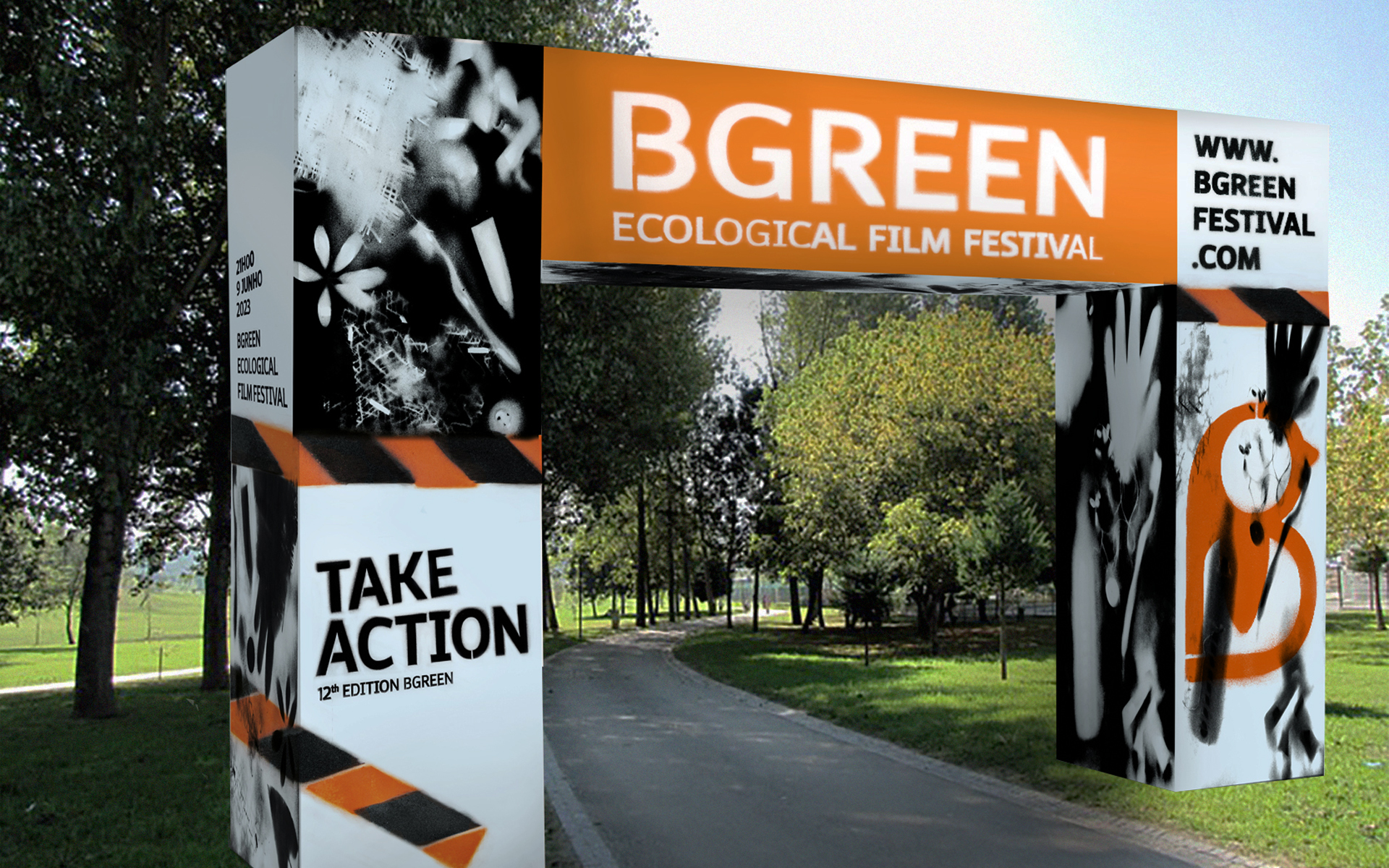
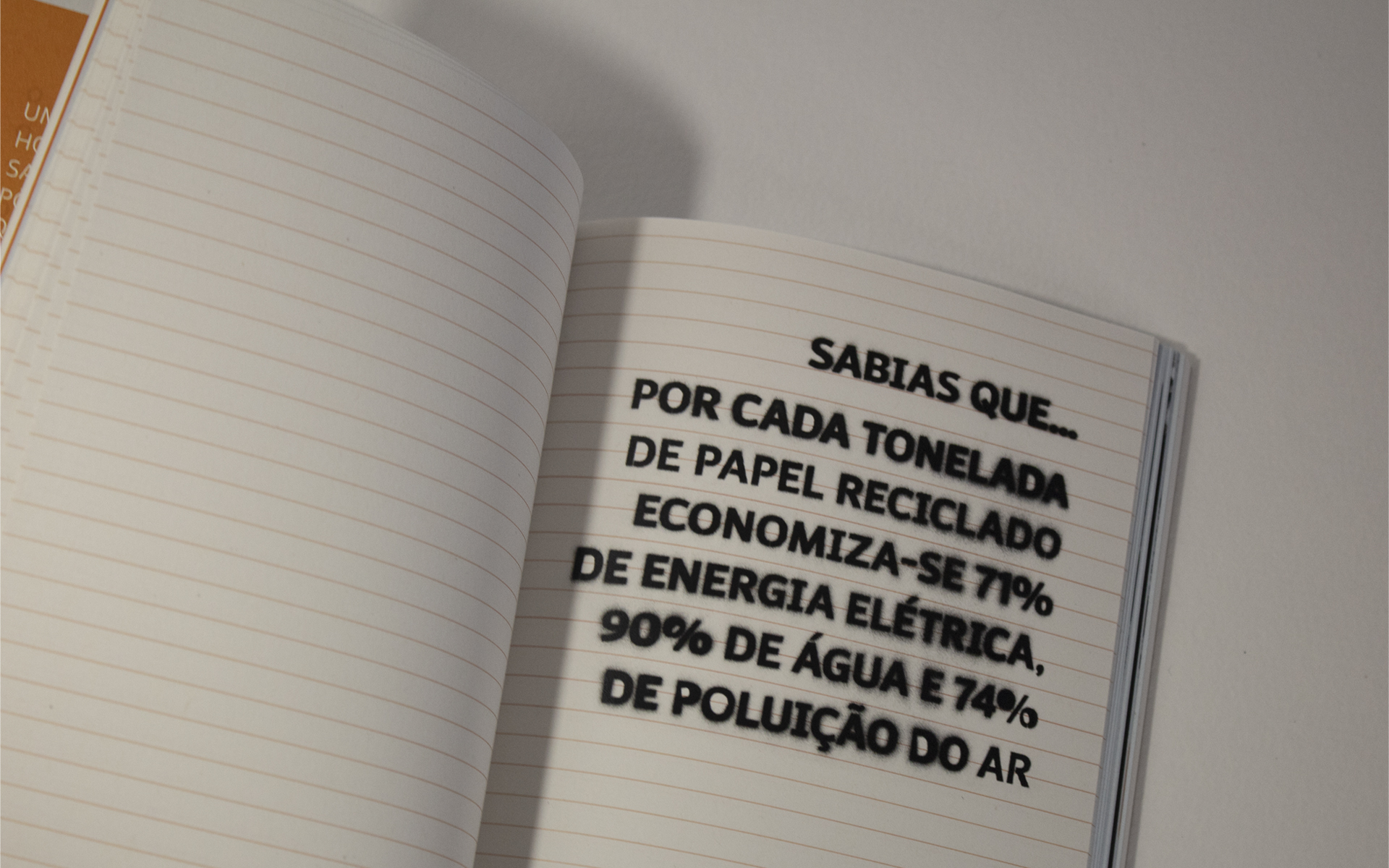
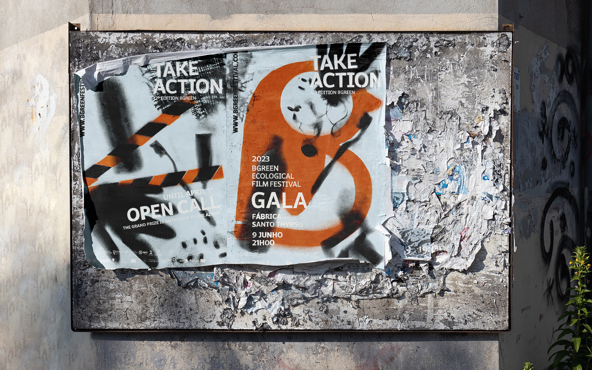
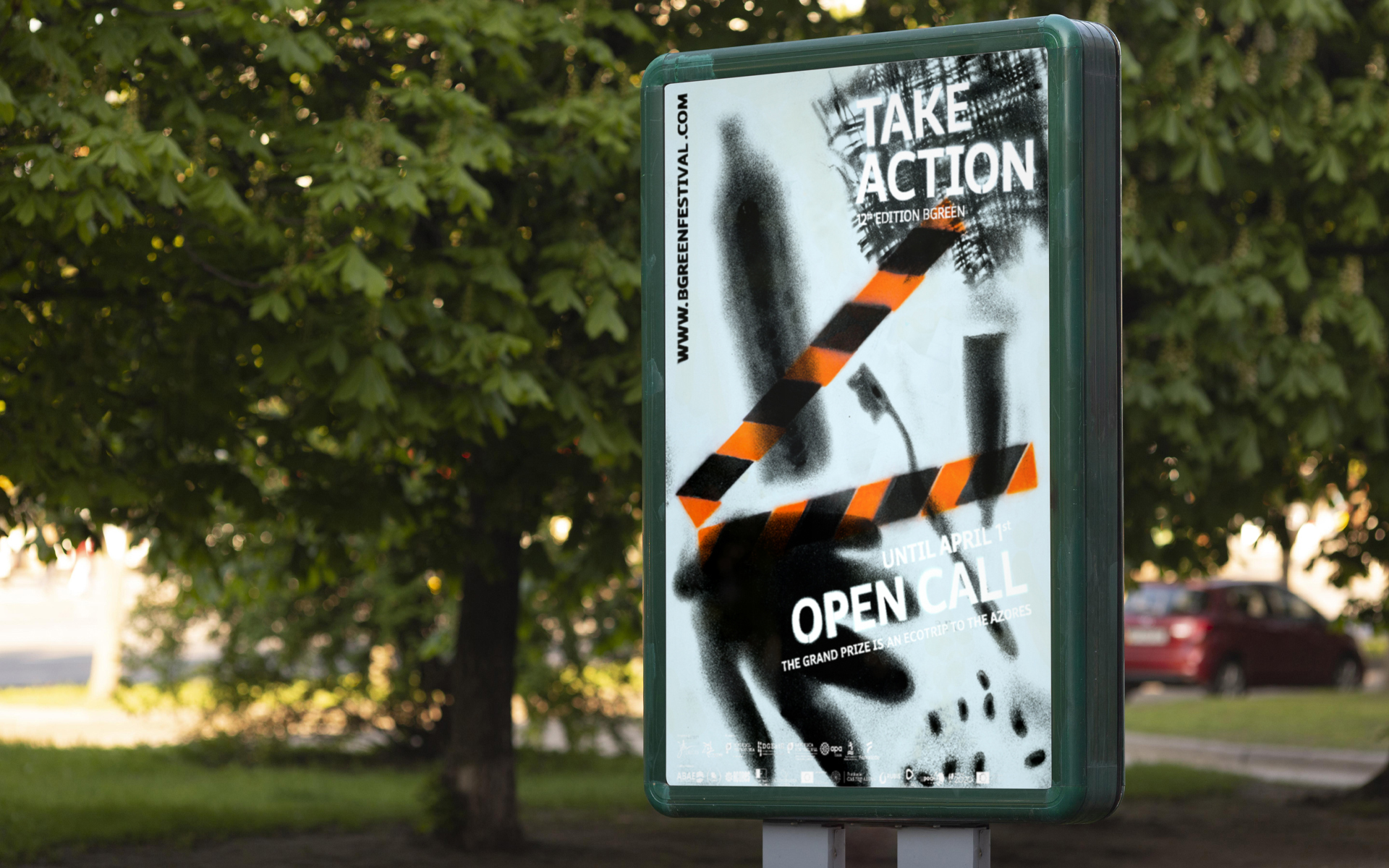
O bgreen ecological film festival é promovido pela OFICINA – Escola Profissional do INA e dirigida a estudantes do ensino básico elou secundário tanto a nível nacional como internacional. Objetivo do Bgreen é sensibilizar os jovens para questões ambientais através de spots vídeo. Este festival está inserido no projeto social Bgreen, composto pelos alunos da escola organizadora, seguindo a premissa Think Globally, Act Locally, pondo mãos à obra para melhorar as condições de vida da comunidade local.
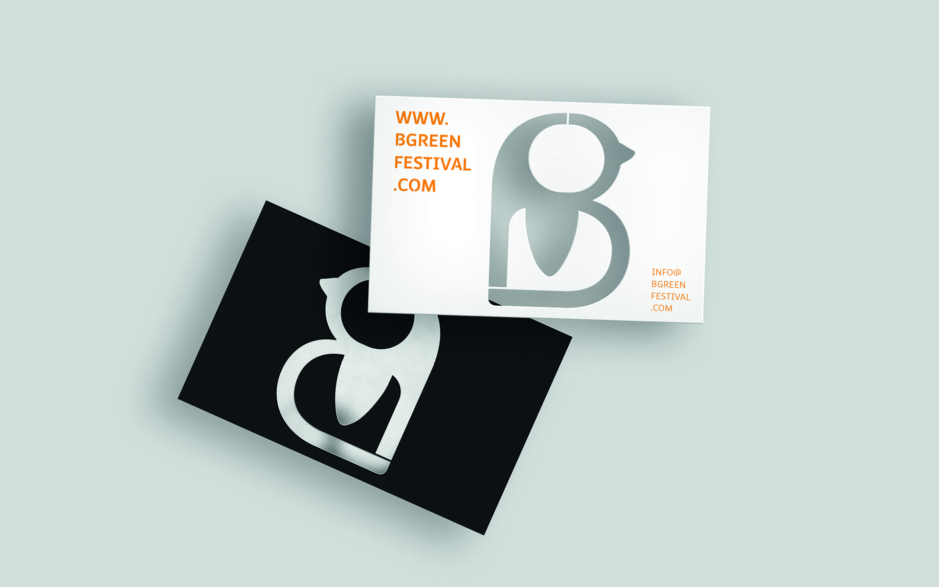
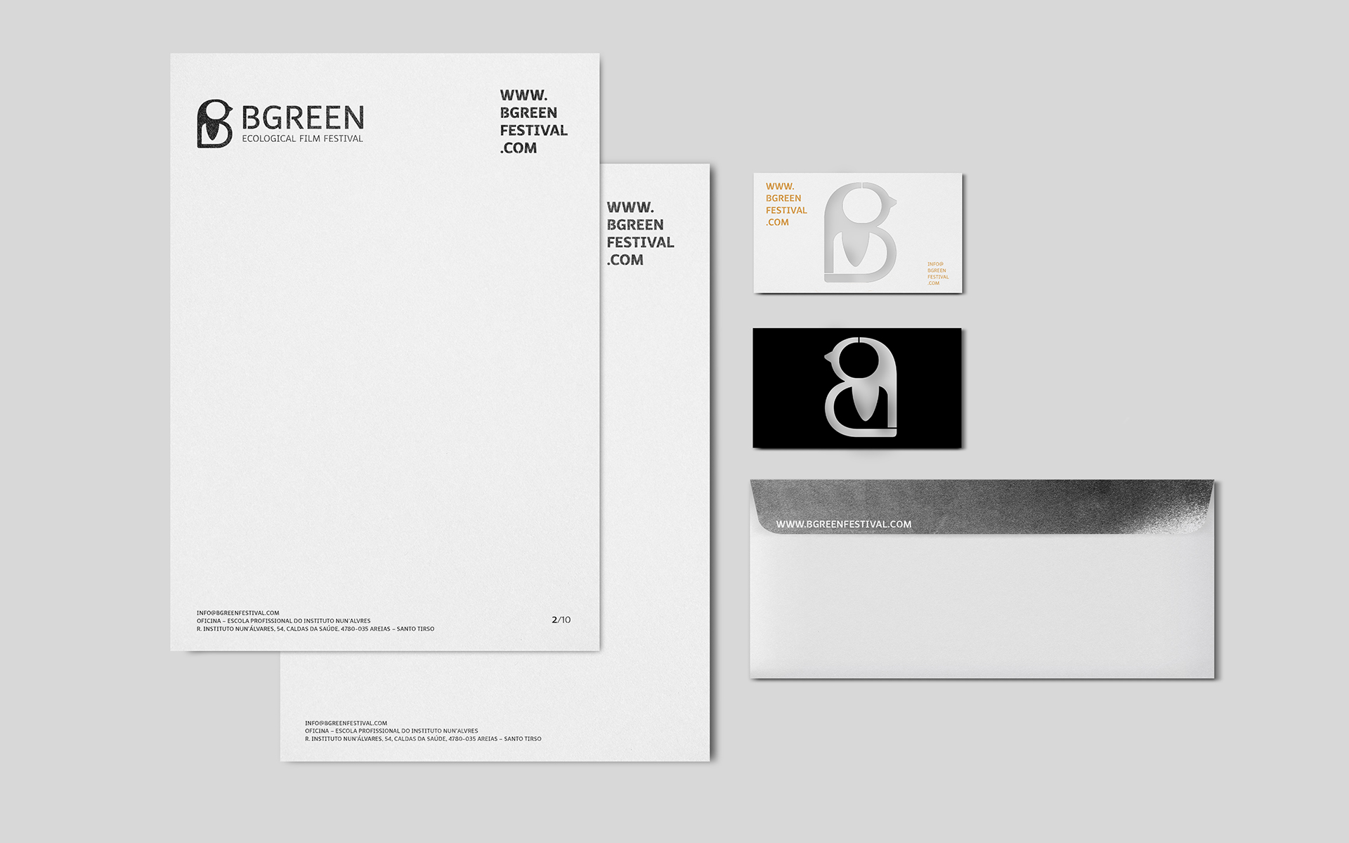
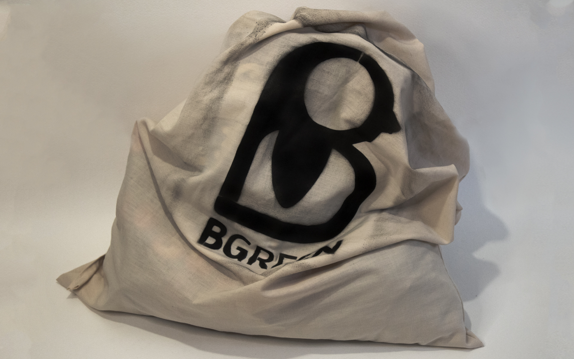
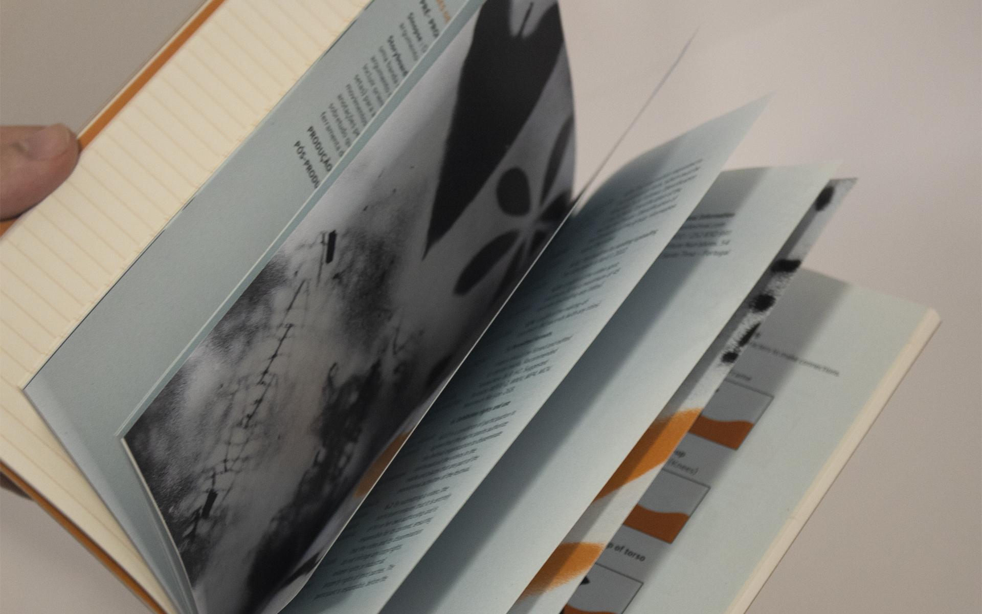
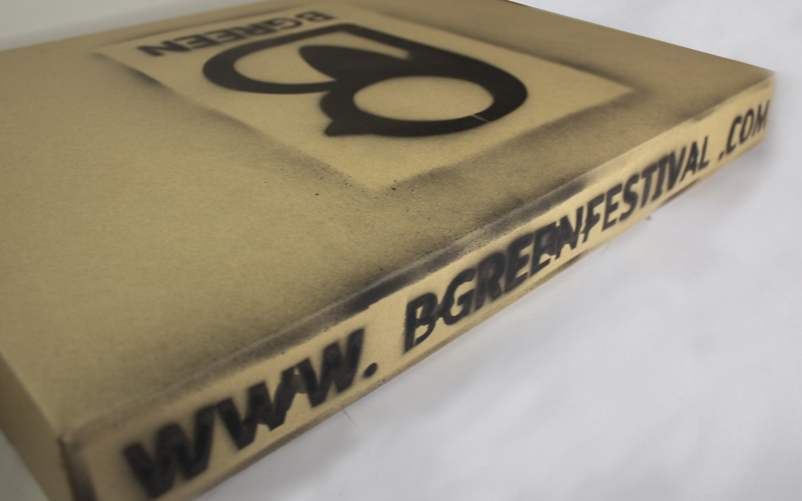
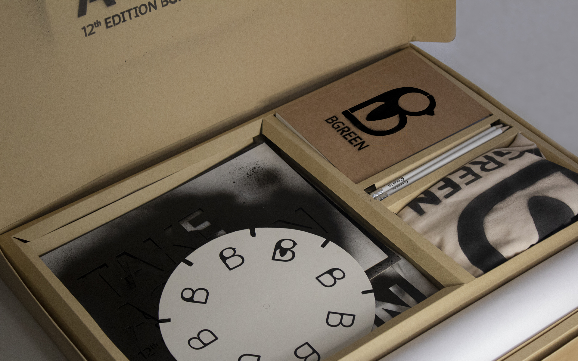
Para a criação desta identidade, parti do conceito Take Action, refletindo o objetivo do evento, alertando para a necessidade de mudança, e de ação perante os problemas ambientais. Daí a escolha da cor laranja, por ser uma cor de destaque. E do stencil como técnica principal, presente em toda a identidade, com destaque para as ilustrações criadas, que transmitem o “lixo” que precisa de ser limpo, para além de passar uma mensagem de intervenção, refletindo o espírito jovem. Permite posteriormente interagir com o público, possibilitando o reaproveitamento de materiais para a comunicação, como t-shirts marcando-as com a identidade do festival, fazendo com que não exista tanto desperdício, que foi também uma preocupação ao longo do projeto.
EN
The bgreen ecological film festival is promoted by OFICINA – Escola Profissional do INA and is aimed at students from primary and secondary schools, both nationally and internationally. Bgreen’s goal is to raise awareness among young people about environmental issues through video spots. This festival is inserted in the Bgreen social project, composed by the students of the organizing school, following the premise Think Globally, Act Locally, putting their hands to work to improve the living conditions of the local community.
For the creation of this identity, I started from the concept Take Action, reflecting the objective of the event, alerting to the need of change, and of action in face of the environmental problems. Hence the choice of orange, as it is a prominent color. And the stencil as the main technique, present in all the identity, highlighting the illustrations created, that transmit the “garbage” that needs to be cleaned, besides passing a message of intervention, reflecting the young spirit. It allows a subsequent interaction with the public, allowing the reuse of communication materials, such as t-shirts, marking them with the festival’s identity, reducing waste, which was also a concern throughout the project.


