
Autoria
João Viana
Curso
Licenciatura em Design Gráfico
Resumo
PT
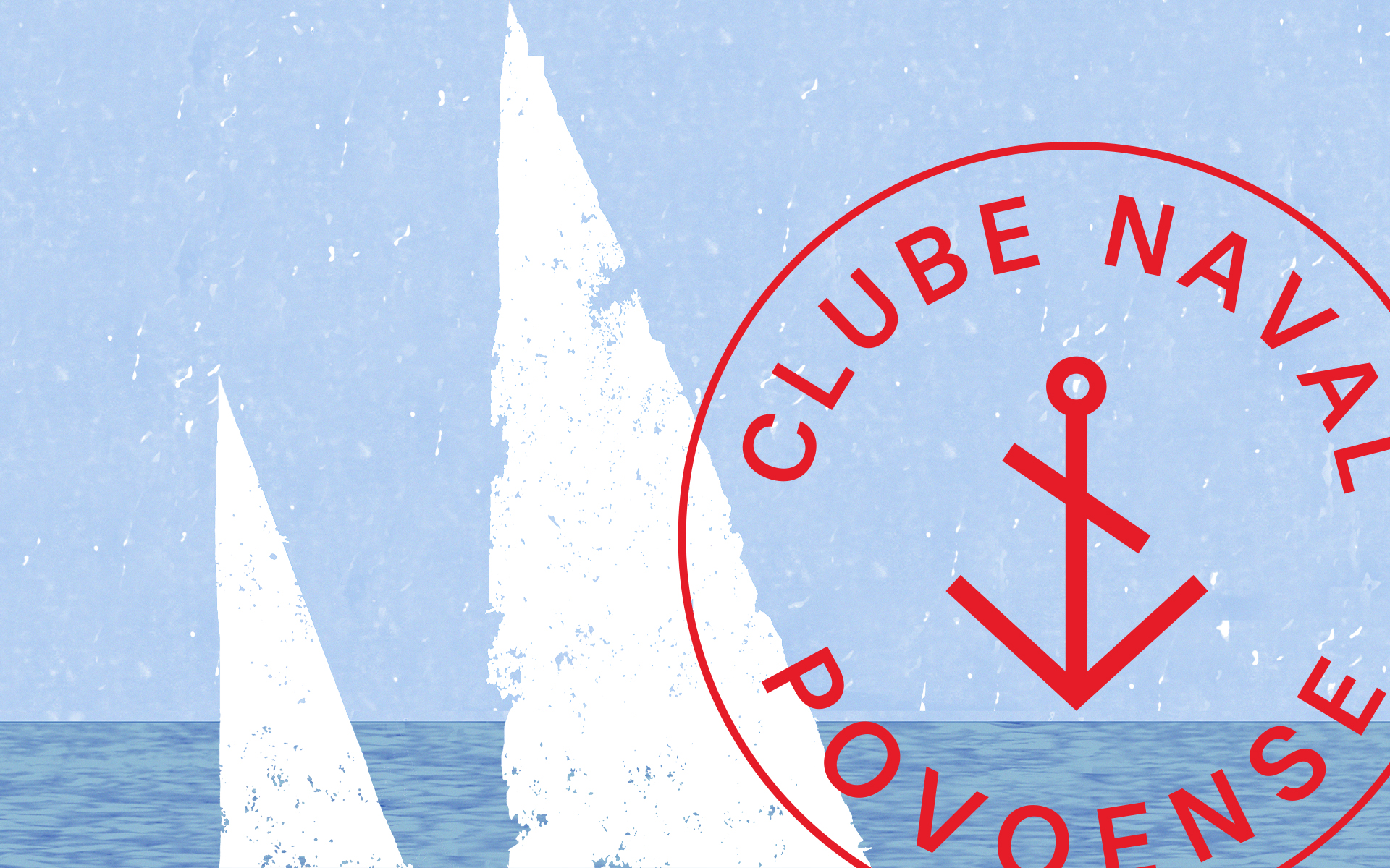
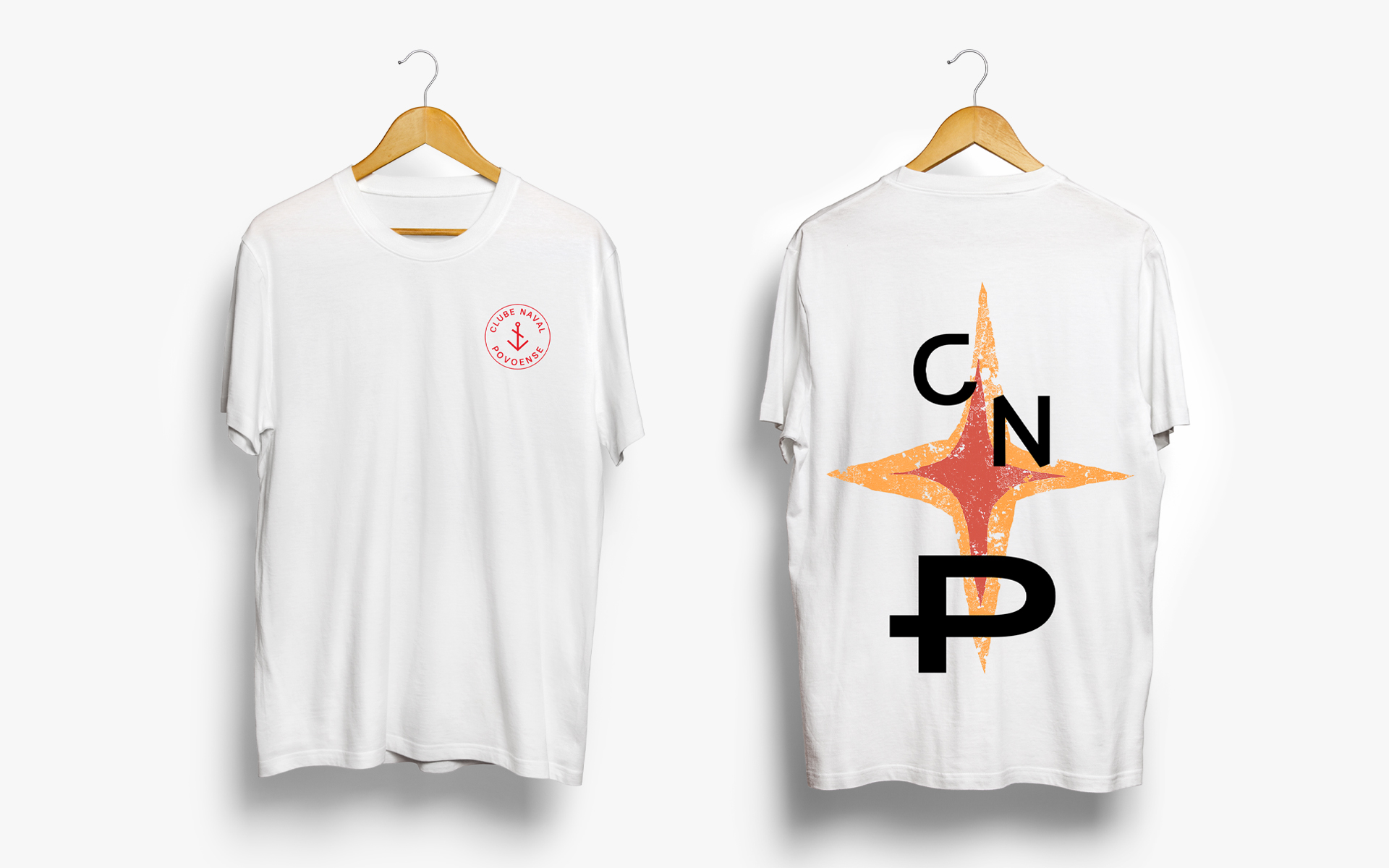
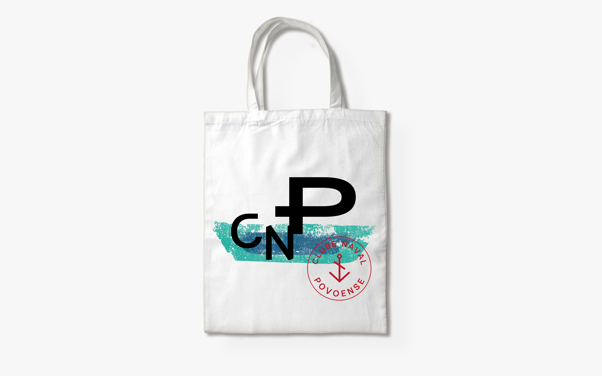
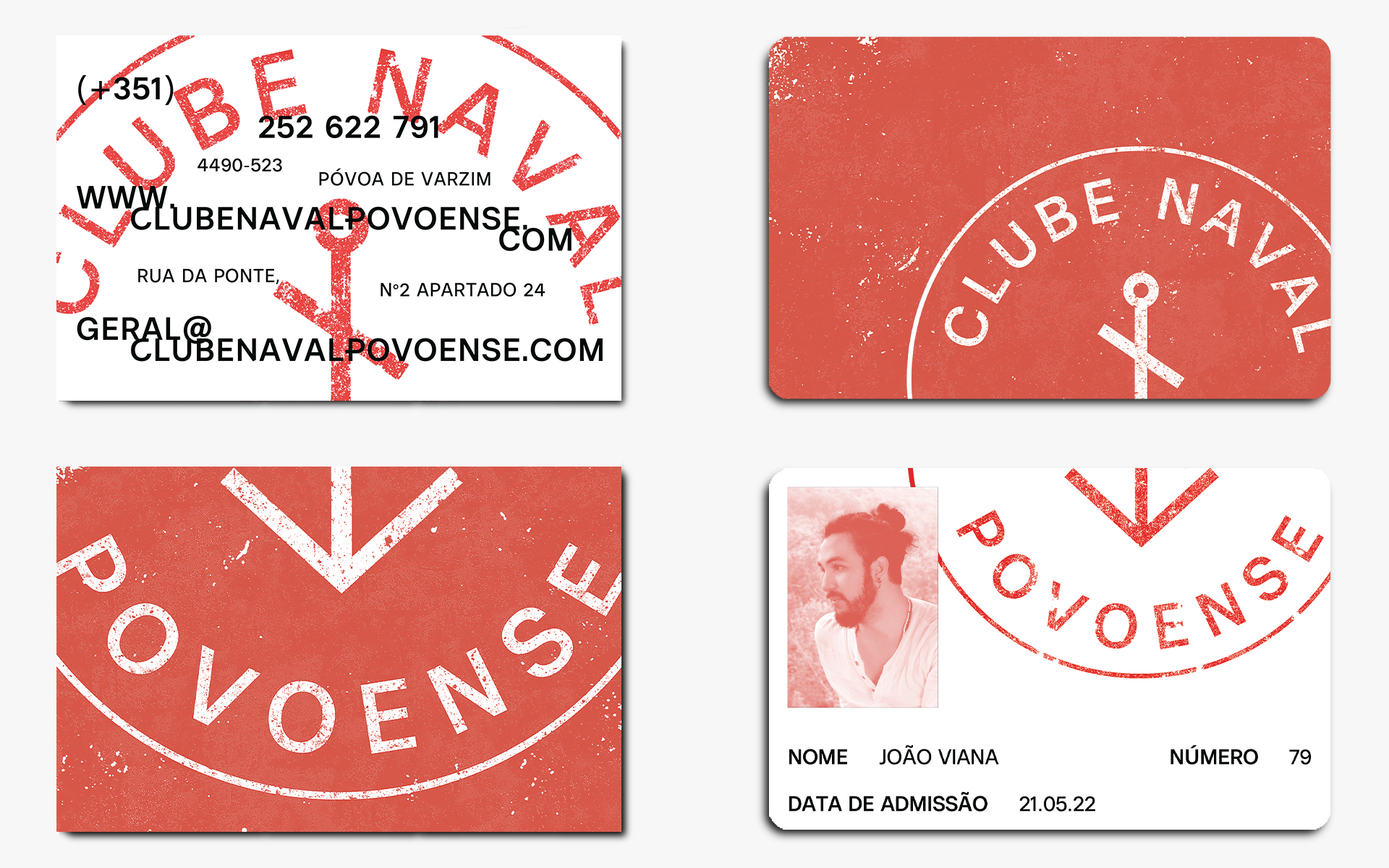
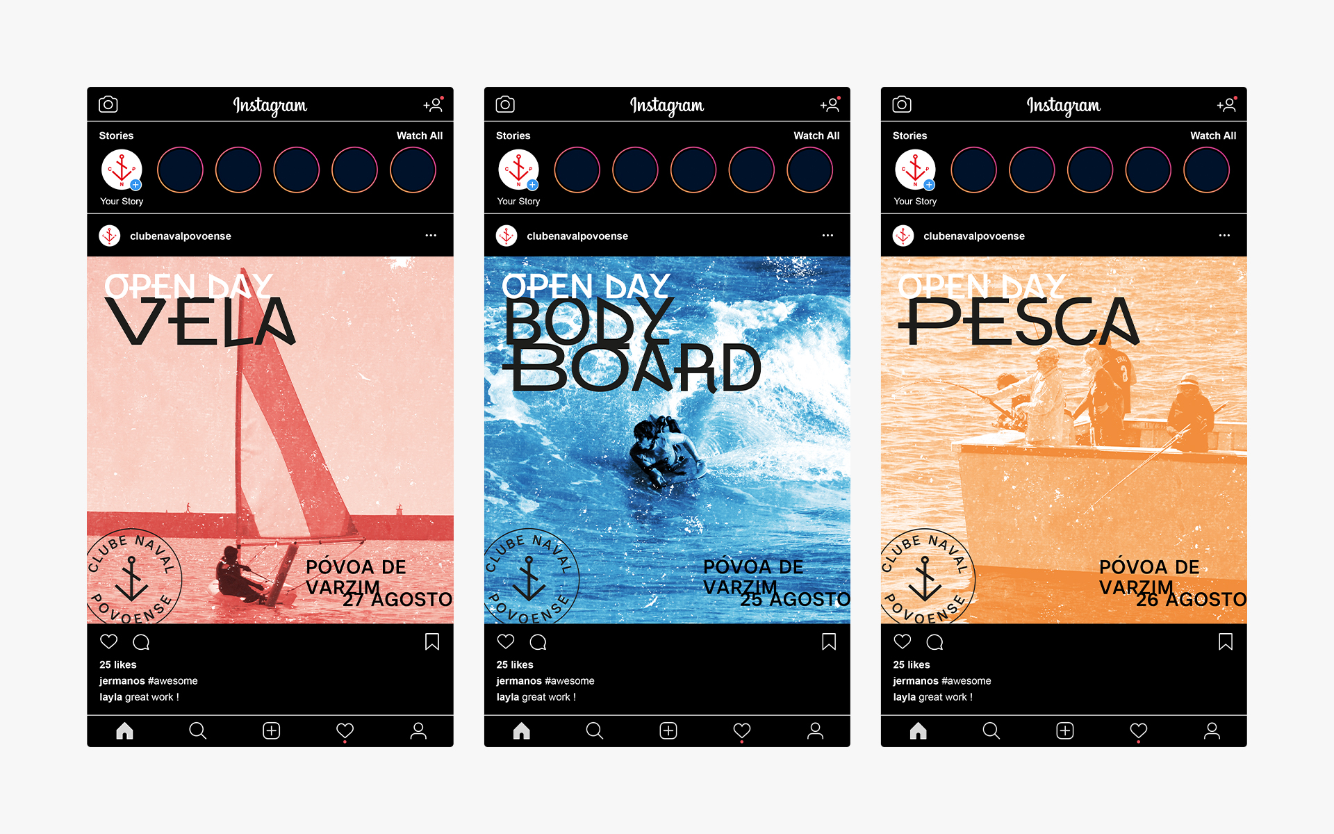
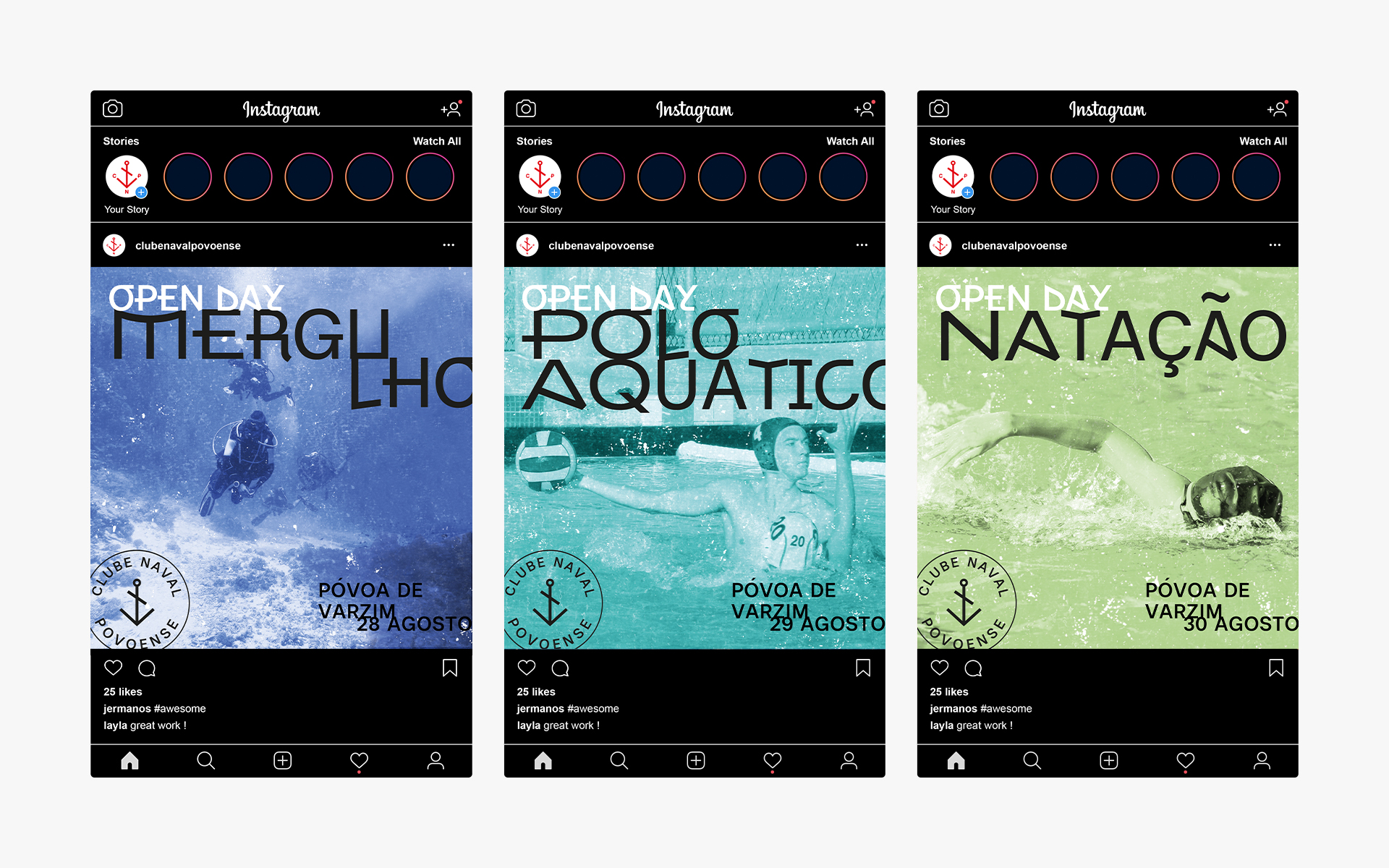
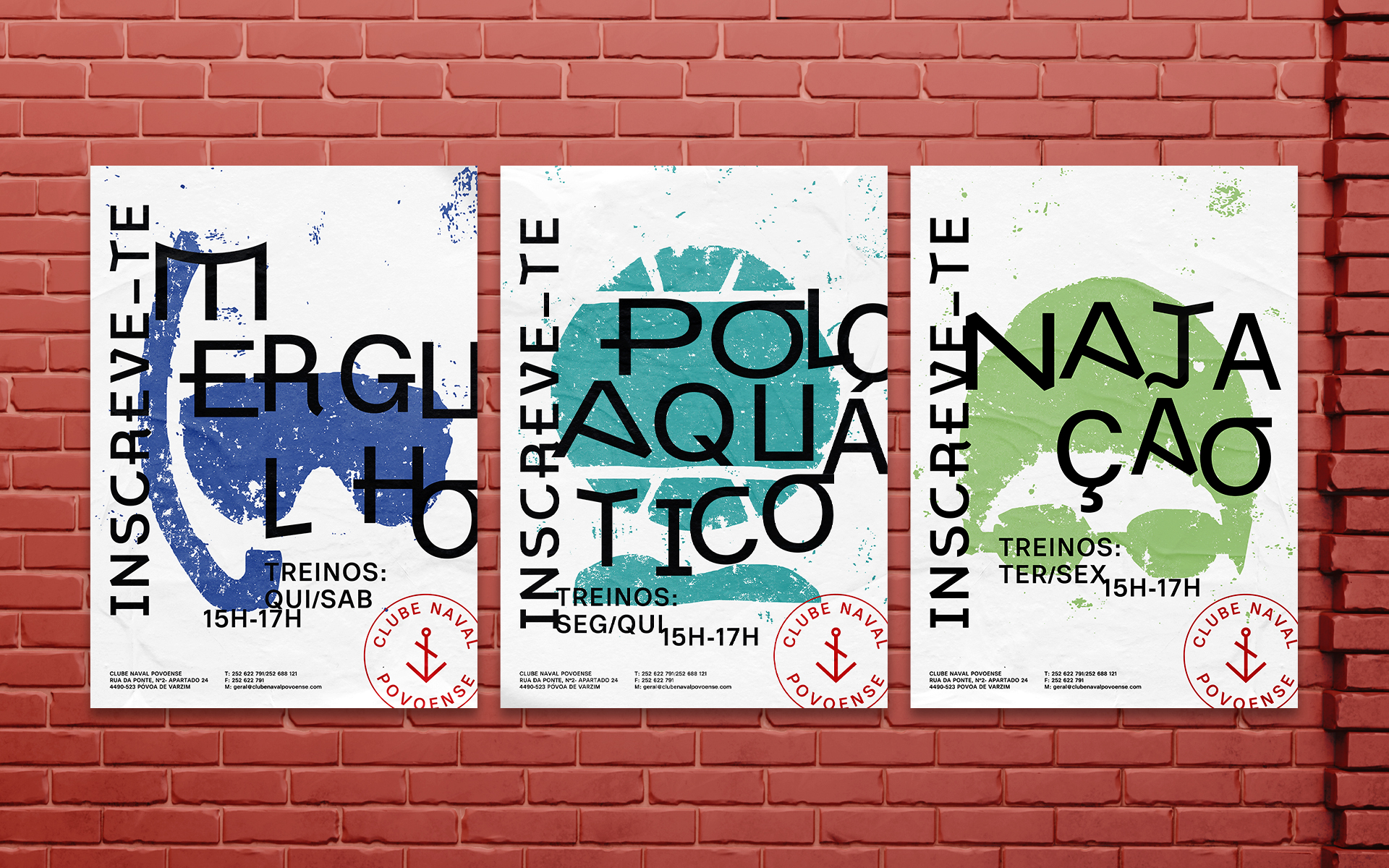
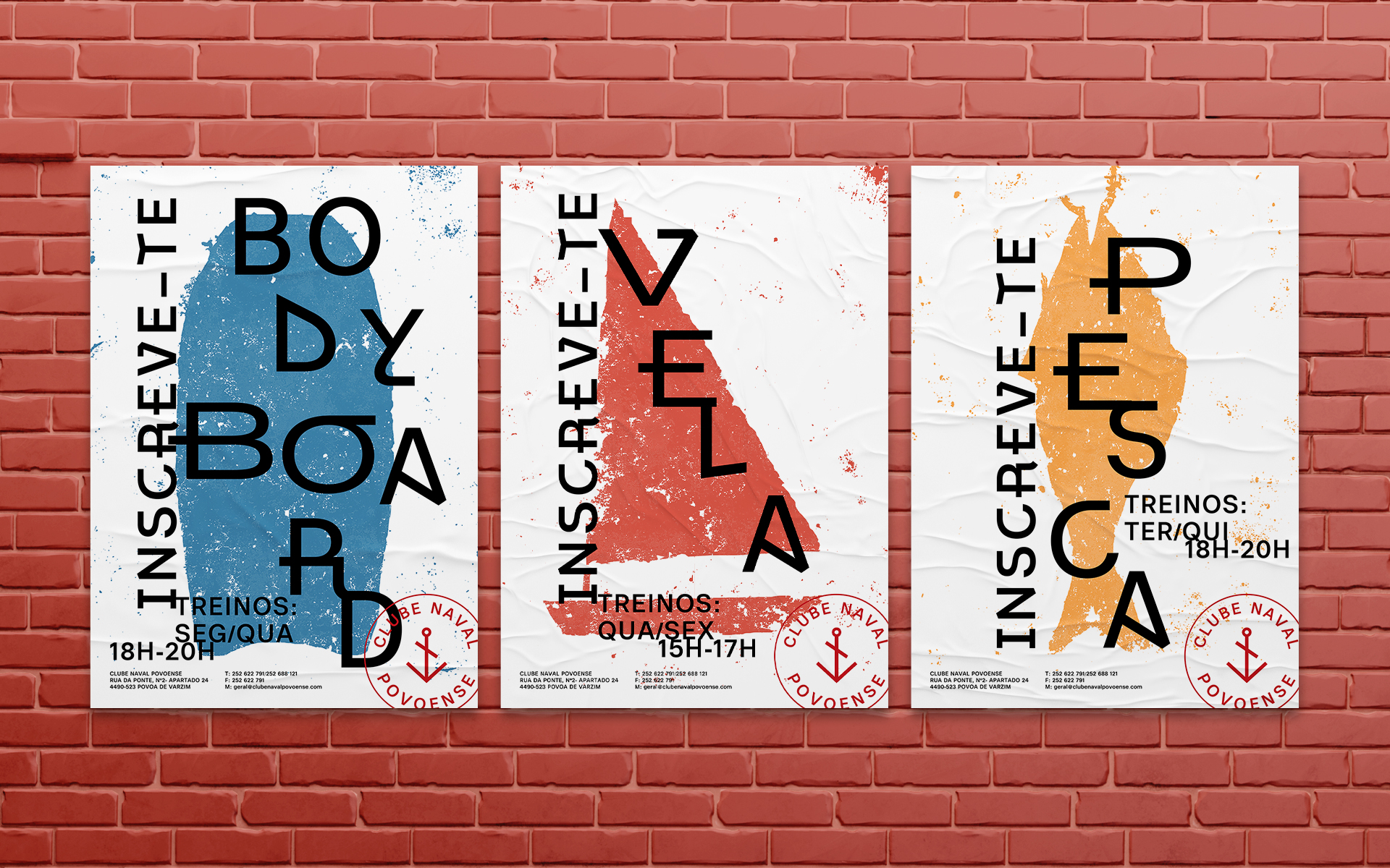
Fundado em 1904, o Clube Naval Povoense é um dos clubes mais antigos e prestigiados da Póvoa de Varzim. Enquanto grupo, desde sempre prestaram altíssimos serviços à terra, tendo participado permanentemente nos acontecimentos sociais e culturais da cidade. Já atualmente, dedicados ao serviço da região na sua vertente náutica, desportiva e de lazer, o clube abrange um total de seis desportos e organiza recorrentemente eventos do mesmo caráter. O objetivo para este projeto foi atualizar a marca enquanto identidade visual, aproximando a população das suas diversas atividades através de uma comunicação eficiente. Conceptualmente, o projeto explora elementos vernaculares presentes na cultura marítima da Póvoa de Varzim. Nos barcos nomeadamente, era visível um conjunto próprio de ilustrações, cujas facilitavam o seu reconhecimento aquando do regresso a terra. Dada essa vertente, este trabalho traz um pouco dessa simbologia, estando presentes diversas ilustrações manuais que refletem cada desporto pertencente ao clube por si trabalhado. As suas imperfeições juntamente com a simplicidade que nelas são percetíveis, ambientam toda uma linguagem que por sua vez, aborda toda essa simbologia histórica da cidade. Em conjunto, foi utilizada uma tipografia específica em inspiração da recolha de registos do clube, cuja apresenta “extensões” e formas distintivas coligadas com as famosas siglas poveiras. A sua colaboração com a ilustração de uma forma informal, reflete todo um espírito “descontraído” que espelha o clube.
EN
Founded in 1904, the Clube Naval Povoense is one of the oldest and most prestigious clubs in Póvoa de Varzim. As a group, they have always provided very high services to the land, having participated permanently in social and cultural events of the city. Already today, dedicated to serving the region in its nautical, sports and leisure, the club covers a total of six sports and recurrently organizes events of the same character. The goal for this project was to update the brand as a visual identity, bringing the population closer to its various activities through efficient communication. Conceptually, the project explores vernacular elements present in the maritime culture of Póvoa de Varzim. In particular, the boats had their own set of illustrations, which facilitated their recognition when returning to land. Given this aspect, this work brings some of that symbolism, being present several hand illustrations that reflect each sport belonging to the club worked by him. Their imperfections along with the simplicity that is perceptible in them, set a whole language that in turn, addresses all this historical symbolism of the city. Together, a specific typography was used in inspiration of the club’s records collection, which presents “extensions” and distinctive shapes connected with the famous poveiras acronyms. Their collaboration with the illustration in an informal way, reflects a whole “relaxed” spirit that mirrors the club.


